Tampa Bay Buccaneers and Tableau Public


This post is part of our Sports Month series. Eric Holland is the Coordinator of Analytics for the Tampa Bay Buccaneers.
The Tampa Bay Buccaneers started using Tableau just over a year ago, primarily for internal business reporting and data visualizations. By using the same features we use internally, Tableau Public has allowed us to tell data-related stories about our team in an interactive way that engages even the casual fan. Originally the Buccaneers “Data Crunch” series was an outsourced endeavor, but with our increased usage of Tableau in reporting, we felt confident that it could be taken on in-house. Below are a few of the articles we made that showcase our utilization of Tableau, as well as an explanation of the motivation behind each project and the features used to create the visualizations.
Our first article employing Tableau Public highlighted how impressive our unheralded second-year quarterback, Mike Glennon, was at this point in his career. Not only were we able to show Mike as superior to his draft-contemporaries, we also showed his place amongst young Buccaneers quarterbacks of all time. By using a sheet selector, fans were able to seamlessly compare the cohort of players across a wide range of differing statistics:

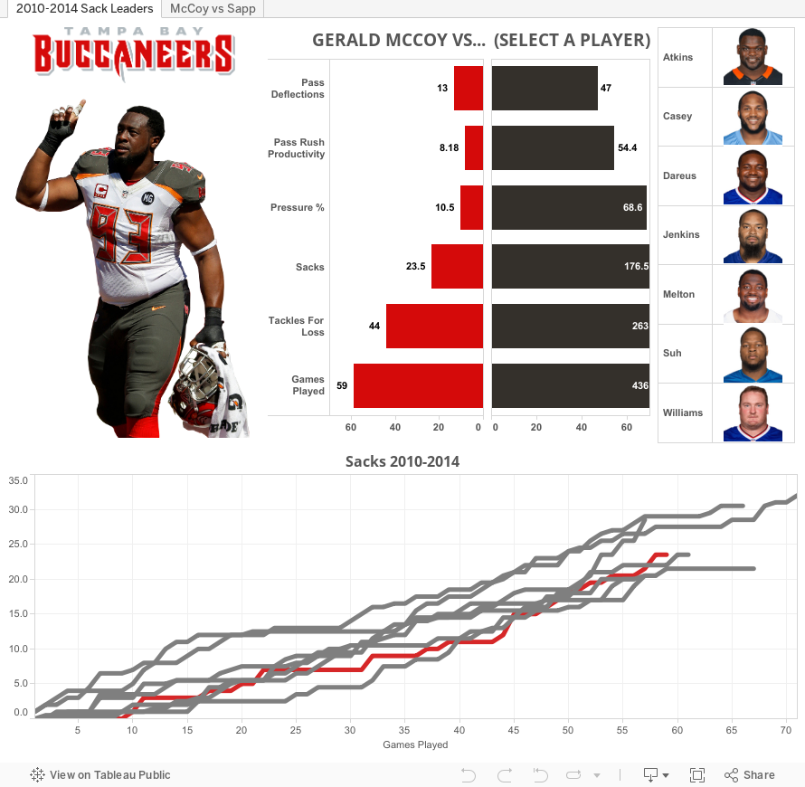
Halfway through the season, we signed our star defensive player, Gerald McCoy, to a long-term contract, ensuring his future with the Bucs. Similar to Glennon, we wanted to celebrate our young player and show how his stats stack up against his peers. To make the visualization interactive, we used a filter action allowing fans to compare McCoy to other players on a 1-on-1 basis. In addition, we took advantage of a common comparison of McCoy to a former Buccaneer legend and recent Hall of Fame inductee that manned the same position, Warren Sapp. Using an additional dashboard, we also showed how McCoy’s career trajectory parallels that of Sapp’s. The dashboard is presented below:
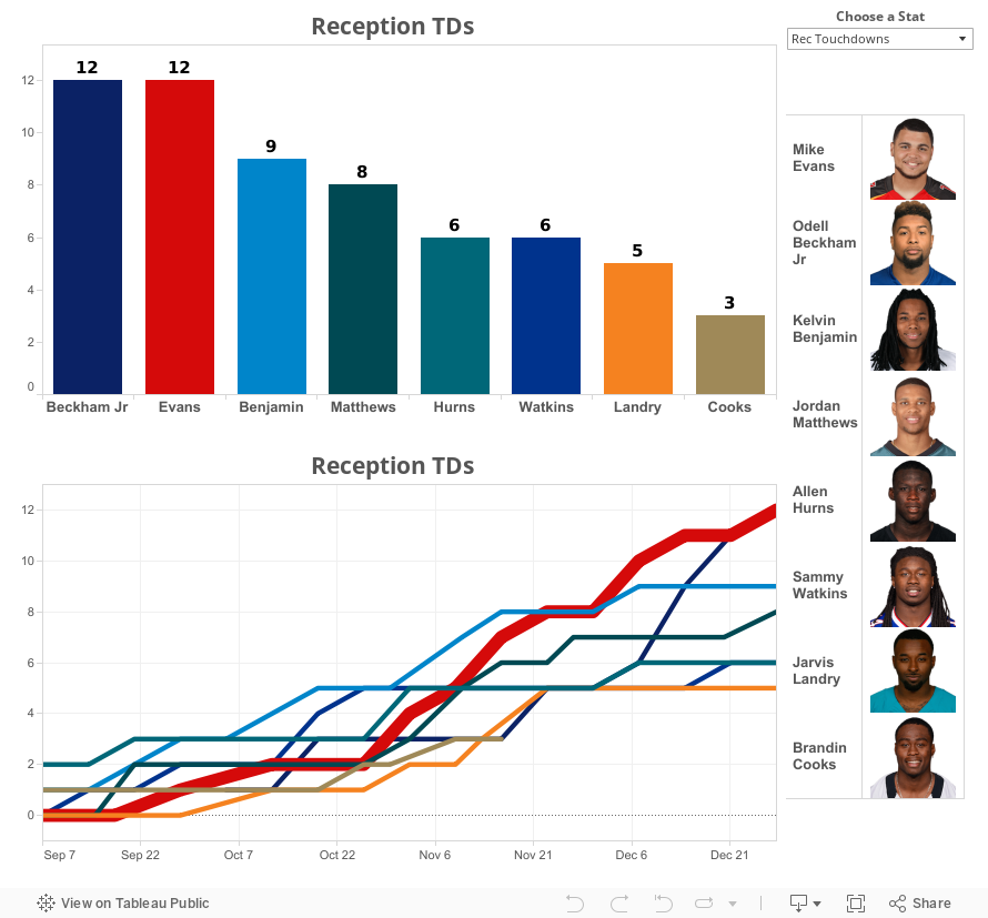
One of the most exciting storylines of our season was the emergence of our first round draft pick, wide receiver Mike Evans. 2014 was a historic season in terms of receiver production from rookies, and Evans was one of the few that garnered Rookie of the Year attention. We found that fans enjoyed checking on Evans’s candidacy for the award and decided to update the stats throughout the season. Using several of the techniques from previous articles, we utilized a global parameter to swap measures and used a third worksheet with custom marks as a legend to allow automated custom sorting and highlight actions for both graphs.
By the end of the season, the success of the Data Crunch series encouraged the use of Tableau Public in other articles in which the visualization would simply complement the story. Although it is difficult to garner much attention in the weeks prior to the Super Bowl when you are not a participant, we wanted to make a Super Bowl relevant story that could also relate to the team. Taking inspiration from an article the FiveThirtyEight blog wrote on the NHL, we attempted to capture the yearly journey of the Lombardi Trophy, awarded to the winner of each Super Bowl since 1967. By imputing the longitude and latitude of each winner, we were able to create a map of the average location of the trophy. Looking to make it more interesting and interactive, we added a URL action to show a custom map of the location (using Google Maps API). It made for a fun article that any NFL fan could enjoy while also showing projections of the next location based on who would win.

Looking forward, we are planning to create visualizations on the NFL Draft coming at the end of April and on former Buccaneers hoping to soon enter the NFL Hall of Fame, so stay tuned to buccaneers.com for more content.
Related Stories

Meet Iron Viz 2024 Finalist Jessica Moon
 April 15, 2024

Meet Iron Viz 2024 Finalist Pata Gogová
April 8, 2024

Student to BI Analyst, How Tableau Can Lead to a Successful Data Career
 March 20, 2024
Subscribe to our blog
Get the latest Tableau updates in your inbox.