5 #DataLessons to Help You On Your Journey


Note: The following is a guest post by Tableau enthusiast Ravi Mistry.
As part of Back-to-School Month, Tableau is leading a conversation about #DataLessons. Aimed for people who have been working with data, the objective is to share lessons for those just getting started on their data journey.
Given I graduated straight into this field (sorta), and have had a very specific education in this field, I thought I'd share five tips, in no particular order.
1. Be Inspired by the Community
Getting started with Tableau can be daunting. The first visualisation that I saw by Chris Love was his incredible, insane, crazy History of the Football League chart.
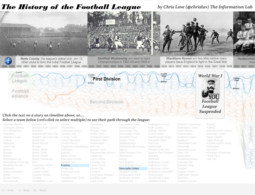
Click to visit the full-size viz.
I remember saying, "He must have used some sort of code." But the honest truth is, Tableau Public being the incredible open resource is, if I did want to look under the hood to see what Chris had done, I could—and I still can. All I have to do is download his workbook
The community is one of the best, best, best parts about Tableau—and, I'd argue, for those working with data in general. Tableau itself is massively non-aggressive and there are mentors, inspirations, and friendly people everywhere, from the Community Forums to the Twittersphere.
2. Come with an Open Mind to Learn
The key part of any lesson is the willingness to learn. There are so many different ways to work with data: to solve a problem, as a hobby to learn more about a subject, to bring to life a concept which you have in your head.
The number of blogs, tutorials, and ways to learn Tableau is growing every day. And similarly, the resources to pick up R, Python, Alteryx, and a whole host of data and data viz tools are also growing almost daily. And long may that continue. It's only through learning that we can improve as a collective and share feedback that makes the learning curve that much more shallow.
3. Keep It Simple/Have a Purpose
When working with data, it's easy to get lost. Your mind begins to wander, and you think to add more and more contextual data, some population data here, some demographics, some spatial... And before you know if, you're lost in a data lake with half a paddle, wondering why you waded into the lake in the first place.
I struggled with this in particular when I was getting started with Tableau. Because of the fast pace at which we were learning, applying, and developing our Tableau knowledge, I wanted to use it all, to use EVERYTHING that I learned into one big, amazing viz.
And that, I can tell you from experience, is not the best way to approach it. Think about the question, the purpose, the reason for creating a visualisation. Complex charts are awesome, but keeping it simple is a great way to understand your tools. You don't build conservatory if you've never built a wall.
4. Fail and Get Better
Getting feedback is the key to getting better, especially given the friendliness of the data-viz community. If something can be improved, and you actively seek advice and critique, then you're well on your way to developing your data skills.
This doesn't just apply to visualisation either; efficiency tips, blogs, meetups—all are legitimate ways of continual improvement, but the enthusiasm and willingness has to be present. The best data-viz folks I know are curious, passionate, and always looking to get better and learn more.
And don't ignore the value of being open to giving feedback, too. Being able to cast fresh eyes on a piece of work is a valuable skill both to give feedback and for learning more about what's "under the hood."
5. Don't be Alarmed When You Start Thinking in Tables!
There will come a time when you’ll begin to conceptualise (even dream!) in tables—what the shape of data should be for the desired output, the steps needed to transform your data to the format you want it to be in, the measures, dimensions, parameters needed to get to where you want to go, and so on. I think this is perfectly normal.
Once you create a table, never be afraid to bend, tweak or break the rules—there are no rules! The bar chart isn't always the best route. The table might not be the most granular view for your data. Data-viz is a field in which you can really be creative and experiment in order to ask and answer questions.
These are a select few of my #DataLessons. But be sure to check out the hashtag on Twitter to see more thoughts from other champions in the community!
For more tips, tricks, and ideas by Ravi, check out his blog and his Tableau Public profile page. You can connect with him on Twitter @Scribblr_42.
Related stories

Meet Iron Viz 2024 Finalist Jessica Moon
 15 April, 2024

Meet Iron Viz 2024 Finalist Pata Gogová
8 April, 2024

Student to BI Analyst, How Tableau Can Lead to a Successful Data Career
 20 March, 2024
Subscribe to our blog
Get the latest Tableau updates in your inbox.