Readers' Choice: Top 5 Vizzes of 2016


What a wild year 2016 has been! And now that it's coming to a close, we can take some time to look back and reflect on the best of the Tableau Public world from the past year. It's time to unveil the top 5 vizzes of the year as chosen by you! We counted down our favorite 25 vizzes from a year of Viz of the Day winners. And from that pool, you, the community, voted to select your favorites. We've tallied the votes, so, without any further ado, here are the winners!
5. Lindsey Poulter: March Madness

4. Skyler Johnson: The Spells of Harry Potter

3. Adam McCann: Beatles Analysis

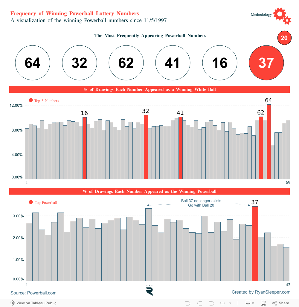
2. Ryan Sleeper: Frequency of Winning Powerball Numbers
1. Ryan Rowland: Forecasting the 2016 Election

Congratulations to all of our winners! The Tableau Public team is excited to see what kind of inventive, informative, and interesting data visualizations our wonderful community comes up with this year. Cheers to 2017!
Related stories

Tableau Community
Meet Iron Viz 2024 Finalist Jessica Moon
 15 April, 2024
Iron Viz finalist Jessica Moon picked a light-hearted topic for her qualifying viz but seriously impressed the judges.

Tableau Community
Meet Iron Viz 2024 Finalist Pata Gogová
8 April, 2024
A qualifying viz dealing with the dark side of love propelled Pata Gogová to the Iron Viz finals at her first attempt.

Tableau Community
Student to BI Analyst, How Tableau Can Lead to a Successful Data Career
 20 March, 2024
This student harnessed the power of Tableau Public for data learning and networking to get her first job in business intelligence.
Subscribe to our blog
Get the latest Tableau updates in your inbox.