Analyzing Airbnb Data


Editor's Note: Jonathan Trajkovic is a Data Analyst working for Synaltic in Paris, France. In this #TravelMonth blog post, Jonathan explains how he built an Airbnb viz to figure out the best place to stay in Luxembourg. Check out more of Jonathan's work on his blog, Tips and Viz with Tableau!
Thanks to Jewel Loree from Tableau Public, I found a dataset about Airbnb. The timing was excellent because I had to choose an Airbnb accomodation for a training in Luxembourg a few weeks ago. When I discovered the website Inside Airbnb, I was surprised to find many CSV files concerning several cities around the world.
As a Frenchman, I chose to start my analysis with Paris, but I did download all the location files to build the visualisation below.
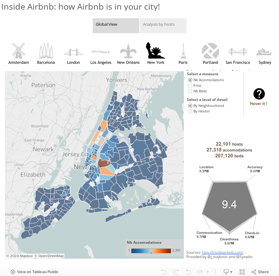
The visualisation is built in two parts. The first part is a "Global view", to present the data from 10 cities with a map and a radar graph. The map is available in two types: by neighbourhood and by hexbin. To draw the hexbin, I used the method described by The Last Data Bender, which uses polygons instead of custom shapes (I think this method is more flexible and beautiful).
The second part is about hosts. I chose to show how the accommodations are distributed by hosts and by city. In this part, each accommodation is located on a map and the Airbnb URL is available.
Don't hesitate to leave a message or a note about this work.
Related Stories

Meet Iron Viz 2024 Finalist Jessica Moon
 April 15, 2024

Meet Iron Viz 2024 Finalist Pata Gogová
April 8, 2024

Student to BI Analyst, How Tableau Can Lead to a Successful Data Career
 March 20, 2024
Subscribe to our blog
Get the latest Tableau updates in your inbox.