How I Learned Data-Viz and Got a Job at Tableau in Just 12 Months


Note: This piece is part of Back-to-School Month here on Tableau Public.
Someone I know recently decided he wants to learn how to build vizzes in Tableau. He wasn’t sure where to start, so he gave me a call since I was in his position just a year ago. He wanted to know what I did to get to where I am today.
You see, I have always been a bit of a geek. Put me in front of a spreadsheet, and I sing. For fun, instead of searching Pinterest for crafting ideas, I’ve always saved infographics, maps, and typeface pages. When I saw a listing for a data-visualization certificate program that required no programming experience, I signed up that same day. Eight months later, I started a new job at Tableau, and now I get to geek out every day.
Talking to my friend got me thinking about my data journey. So I thought I'd share the highlights.
0 - 3 Months
I focused on two things in the early months: learning the basics of data visualization and volunteering as much as I could.
I enrolled in the certificate program because I hoped that with regular classes and a good teacher, I’d come away with a portfolio of work, connections with other students in the class, and possibly a recommendation from an instructor.
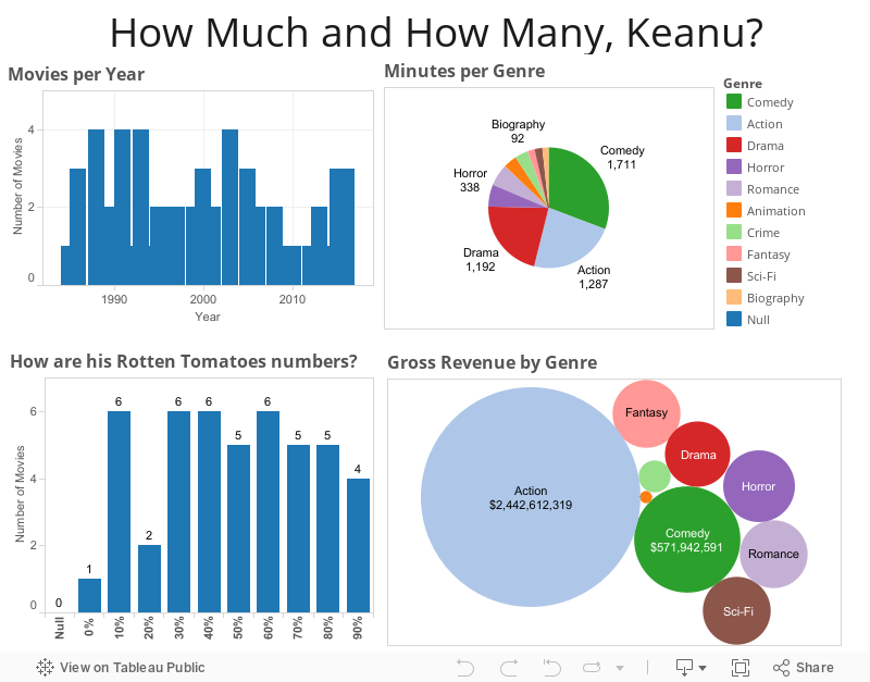
Advice: When building your first visualizations, pick topics that are fun for you, no matter how silly. You’ll stay engaged longer and you’re more likely to recognize problems with how you’re visualizing the data if you’re familiar with the subject. I spoke with someone just last week who told me she’d learned Tableau by visualizing how many cups of coffee were consumed by the different characters on Twin Peaks. I visualized Keanu Reeves’ career. Sure, it’s not the prettiest thing I’ve ever built, but I’m not embarrassed, either. Everyone starts somewhere.
And why did I spend so much time volunteering?
I knew I wasn’t a strong business analyst, but I care deeply about social issues. I learned the language of the causes, and I made connections with the organizations. When they had data to share, I was in a great position to viz it for them.
4 - 6 Months
After a few months of classes, I was starting to develop some skills. But I knew I needed to push myself harder if I wanted to make a career move. I requested an invitation to Tapestry Conference to do a little networking with data storytellers and show off my growing portfolio.
I set the conference as my big goal and picked two data sets I thought would push me to create something new. I had enough muscle that I could keep up with vizzes for school, but I volunteered to demo one of my big vizzes at the event. This would be my little coming-out party to the community—if I didn’t fall flat on my face.
Advice: Set a stretch goal with a date, preferably involving other people and a data set or skill level you haven’t met.
I demoed this at Tapestry:
Also shown briefly at Tapestry:
6 - 9 Months
I’d been building vizzes for barely six months now. It was time to do some serious networking and honing of my skills.
If I haven’t said it already, let me say it now. I practice a lot. Weekly classes meant weekly homework, volunteer visualizations meant I was getting new data sets regularly. But I realized that I was spending hours— sometimes days—on a single viz. I needed a new approach, and #MakeoverMonday came at exactly the right time for me.
#MakeoverMonday is a weekly challenge for folks to reinterpret visualizations in the news. The rules are simple: You must try to approach the data in the same way as the original story (meaning you can’t introduce new data). And you should limit your time to no more than an hour. I jumped in enthusiastically, and saw myself get faster and more focused.
Here’s an example of a #MakeoverMonday viz alongside my viz, which I remagined in about 20 minutes.
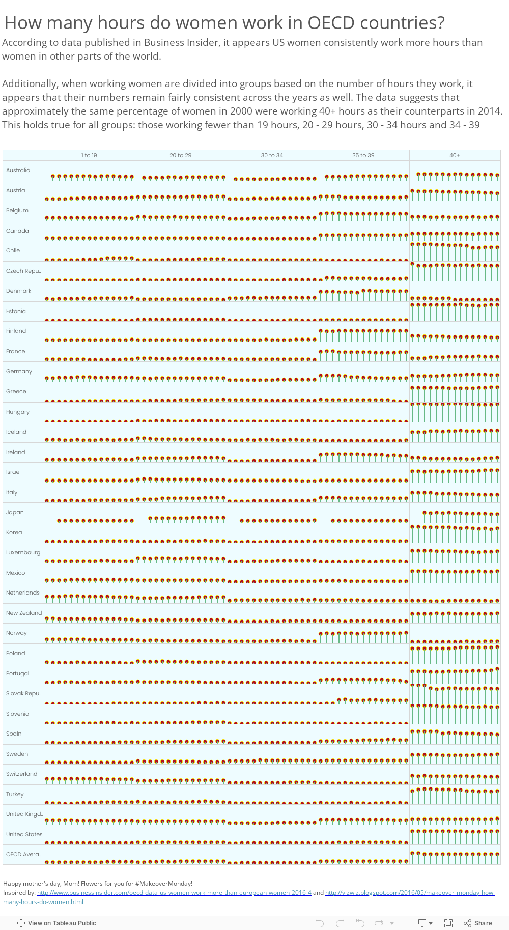
For week 19, the topic came from Business Insider: "American Women Work Way More Than Their European Counterparts."
Here's the original:

And here's my makeover:
#MakeoverMonday also gave me exposure and forced me to socialize my work with others doing the challenges (and still others willing to give feedback). I started following folks on Twitter, reading the Tableau and Tableau Public blogs, and searching for mentors in the data storytelling community.
Advice: As I started to find folks to follow I also started to take a closer look at their Tableau workbooks. That little button in the lower right allowed me to download workbooks so I could learn how people did things I thought were cool. Bookmark and follow folks, but don’t be afraid to download their work and learn hands-on.
9 - 12 Months
While I still don’t think of myself as a data analyst, all of the practice, networking, and socializing have made my work better.
I finished my certificate program and presented my capstone project. I took everything I learned from my classes and from mentors and tried to present a solid story with a thoughtful design. It’s a far cry from my first Keanu Reeves visualization, but I know I still have a long way to go.
Advice: Setting big goals and completing big projects are part of building a solid portfolio. Even if you don’t have school or an event driving your timeline, plan these regularly to keep your skills sharp and to keep up with new features!
So here I am. Yes, I took a class, and yes, it took a lot of extra effort and more hours than I care to admit. But you don’t need to approach this solo. The community is full of people willing and able to help when you’re stuck. Tableau offers a ton of how-to videos and blog posts, and there are fantastic data visualization and storytelling programs at schools across the country, many of them online. And you can always reach out to me and the Tableau Public team if you need a little nudge!
Related Stories

Meet Iron Viz 2024 Finalist Jessica Moon
 April 15, 2024

Meet Iron Viz 2024 Finalist Pata Gogová
April 8, 2024

Student to BI Analyst, How Tableau Can Lead to a Successful Data Career
 March 20, 2024
Subscribe to our blog
Get the latest Tableau updates in your inbox.