The Different Types of Tableau Public Authors and Viz of the Days


Here in the world of Tableau Public, we have just crossed an important and impressive milestone: This week our 150,000th author will activate their Tableau Public account. It is a moment for celebration, surely, but also an opportunity for reflection: how do we the Tableau Public Team continue to represent and highlight the amazing work being done by all of these diverse authors in our ever-expanding user-base? It is a problem that many communities face under rapid growth environments, a problem of scalability.
As our community has grown, we have witnessed the exciting proliferation of different ‘types’, or ‘brands’ of vizzers, different cohorts of authors within the larger Tableau Public community:
- There are the bloggers, vizzing about topics they are interested in
- There are the community groups, vizzing about topics of local interest to them, their families, their neighbors, their local community
- There are the data evangelists, creating vizzes that allow users to access a complicated dataset through a data visualization portal
- There are the journalists, some who prefer to publish quick charts within an article or others who create dashboards as part of feature stories
By no means is this list exhaustive, and if you think there are other major groups I am leaving out, please leave a comment below. This is not a static list, either. One of the most incredible things about the Tableau Public community is how it is constantly evolving to serve the data visualization needs of the present day – this is what keeps the community so dynamic, and vibrant.
As our community has now grown to over 150,000 users, we have decided to start focusing more on the different groups of users within it. So, with this post, I will initiate a new series on the Tableau Public Blog: Viz of the Day Retrospective. In this series we will periodically look back on the recent VOTD winners and write up how some of them fit – or don’t fit – into the different author cohorts that we see within the Tableau Public community. We will shine light on these VOTDs by analyzing their design, how they communicate their data, and how they move us. It will provide us the Tableau Public team a chance to comment on the direction that we see – through our lens of the Tableau Public community - the data visualization space moving.
Journalists
Journalists use Tableau Public to give their readers a different perspective on the story that they are telling. Presenting data in a tangible way through an interactive data visualization can lend a new dimension to news articles, one that can help retain reader’s attentions for longer than normal.
The below visualization appeared in the Huffington Post in an article on police body cameras in the United States. It is a simple visualization, not so much a dashboard but a single map, showing clearly and succinctly how laws differ between states. This is a good example of a supporting chart, not a standalone dashboard, type of visualization. Both are commonly found in news articles.

Data Evangelists
The GDELT Project monitors the world’s broadcast, print and web news from the entire globe. It follows over 100 different languages and identifies the people, locations, organizations, counts, themes, sources, emotions and events driving our global society every second of every day. To say that it is a massive and important dataset would be an understatement. The problem is, the data is hard to access.
Enter in Shine Pulikathara, an evangelist for data transparency who has created visualizations about such important topics as crime in the United States and the rising global temperatures. Shine is passionate about creating well-designed, visually stimulating portals through which the masses can access these large and important datasets and ask their own questions and seek their own answers of them. See, for a perfect example, his work below visualizing the GDELT database.

Community Groups
Brit Cava attended a session at Tableau Conference 2015 called “Every Data Rockstar Needs a Stage”. Soon after doing so, she created this visualization looking at Airbnb prices in San Francisco. It is a great dashboard analyzing an important topic for people who live in San Francisco, published around the time that Prop F was being voted on. Brit does a nice job of incorporating the Airbnb logo and colors throughout the dashboard, making the content of the data instantly recognizable to viewers. She uses filter and highlight actions to encourage intra-sheet interactivity, which lets a user, focus the view on whatever data they are most interested in.
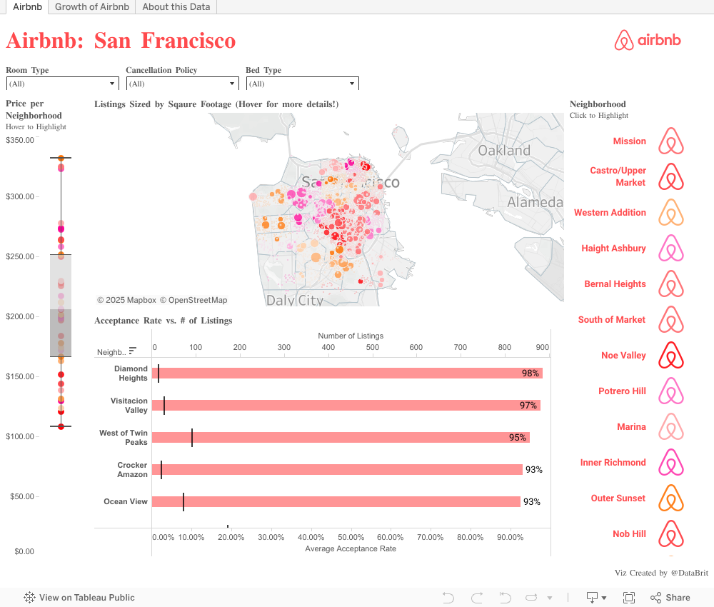
Brit took an issue that was relevant to San Francisco residents, found fascinating data on it, and elegantly visualized it with Tableau Public. Her output is a dashboard that is approachable by both those with great knowledge of San Francisco and of the debate around the prop F issue, and by those with little knowledge. Her work here is a great example of the Community Groups cohort of Tableau Public authors.
Bloggers
Bloggers use Tableau Public as a means to convey their interests to their audience. Tableau Public is a perfect tool for bloggers to spice up their posts, allowing readers to interact with their content in a profound way. Mike Moore, who blogs on his Data Intuition site, has exemplified this approach in the below viz on the Beatles writing contributions by album.

This is a beautiful visualization: well-formatted, powerfully data-driven, impeccably designed. It is both a standalone exploratory application and a valuable storytelling asset for his blog post article. Mike demonstrates a clean sense of design by using just two colors and one chart type throughout the dashboard. The pictures of the four Beatles – familiar enough to be identified by just their profiles – accentuates the simplicity of his data visualization.
Historias relacionadas

Meet Iron Viz 2024 Finalist Jessica Moon
 15 Abril, 2024

Meet Iron Viz 2024 Finalist Pata Gogová
8 Abril, 2024

Student to BI Analyst, How Tableau Can Lead to a Successful Data Career
 20 Marzo, 2024
Suscribirse a nuestro blog
Obtenga las últimas actualizaciones de Tableau en su bandeja de entrada.