Welcome, InfoActive Users!
Here at Tableau, our mission is to help people see and understand their data. With Tableau Public, we offer a free and powerful visual analytics platform that enables you to create, publish and share interactive dashboards and data stories on the web.
Since it was launched in 2010, Tableau Public has been used by over 100,000 bloggers, journalists, researchers and students to create, publish and discover over 500,000 data stories that have been viewed over half a billion times by readers around the world. Publications like Wall Street Journal, La Nacion and CNBC use Tableau Public for their data visualizations.
Tableau Public is completely free to download and use, and we recently made our premium features free for all account holders as well. The ability to protect your underlying data, 10GB of storage and connection to 10 million rows of data are all yours to put to good use.
So we invite you to try Tableau Public today, and we are always available at public@tableau.com if you have any questions.
Happy Vizzing!
The Tableau Public Team
Helping You Get Started
For those of you who are new to Tableau Public, here are some resources to help you get started:
- You'll need some data. Our Sample Data Sets page is a good place to start
- Watch our series of six How-To videos and see how to build and share your own Tableau Public visualization
- Tableau Public's Jewel Loree is conducting a special webinar for InfoActive users like you on August 13th, 2015 at 10:30am PST to learn how to use Tableau Public. Register here.
- If you can't make Jewel's session, feel free to join us for one of our weekly live training webinars, "How to Create a Visualization and Publish to the Web"
Other Data Visualization Tools
We're proud to be among the first and best data visualization platforms available on the web. Here are a few other tools to try out as we work together to build numerical literacy and foster a healthy dialogue around data:
- Plotly - "Collaborative Data Science"
- Infogram - "Charts and Infographics the Easy Way"
- Datawrapper - "Create charts and maps in just four steps"
Tableau Public Examples
If you'd like to see how others have used Tableau Public to turn spreadsheets into vizzes, here are some galleries for you to check out:
- The Viz of the Day gallery gives you an interesting and notable visualization from across the web each day
- Our Greatest Hits gallery includes some of the best visualizations ever created with Tableau Public
- Below are some additional examples we thought you'd appreciate
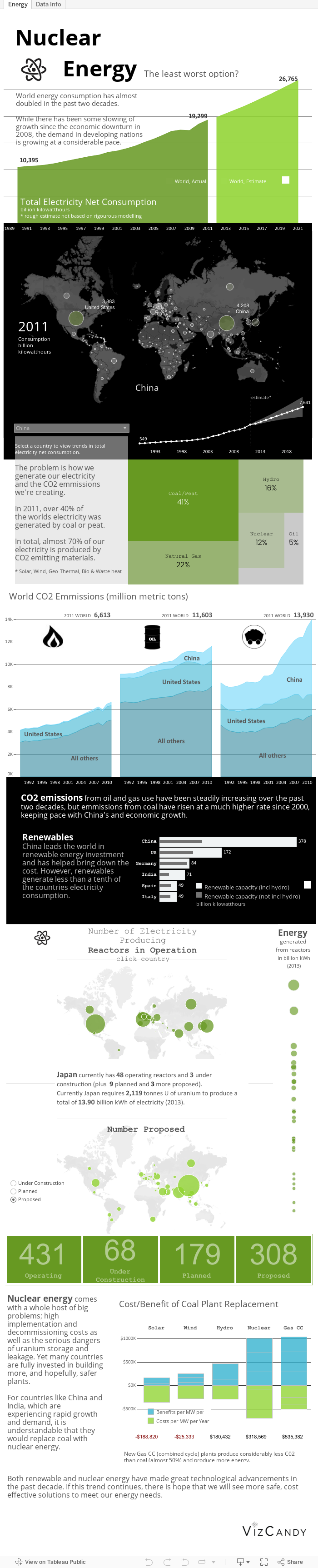
"Nuclear Energy: the least worst option?" by Kelly Martin:
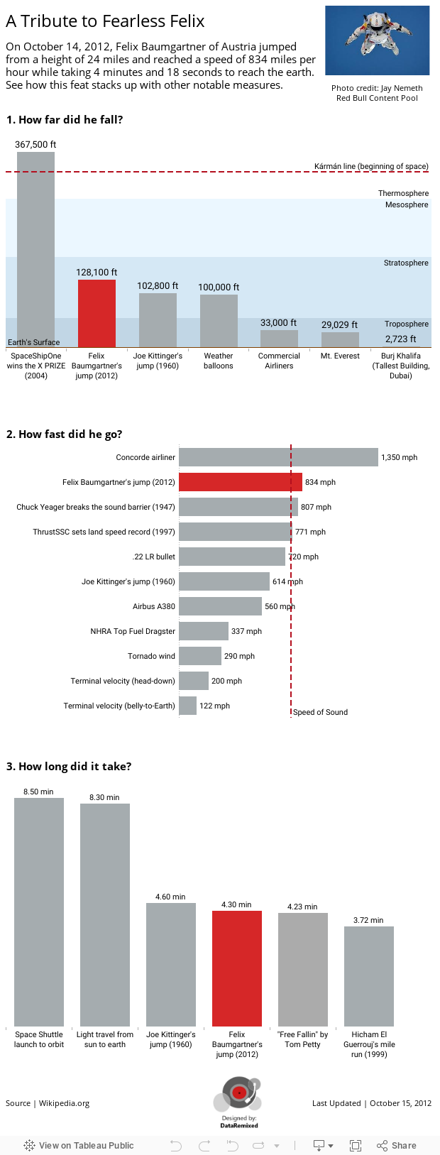
"A Tribute to Fearless Felix" by Ben Jones: