Use Tableau to Hack Your Bracket


This is the first blog post in our Sports Month series. Jay Lewis is a financial data analyst who runs the blog 64to1
Winning a March Madness pool is often a matter of picking a reasonably probable path that can separate your bracket from the pack.
To help out on that front, here’s a matchup guide in Tableau that’ll allow you to explore any possible pairing from the field of 68. The dashboard calculates head-to-head win probabilities and score projections using metrics from basketball statistician Ken Pomeroy and a Bill James formula called Log5. It also leverages team-level, player-level, and game-level data from sports-reference.com to help you evaluate which teams are likely to be more reliant on three-point shooting, which are likely to accelerate or decelerate the tempo (possessions per 40 minutes), and which have deeper rosters relative to their opponents.
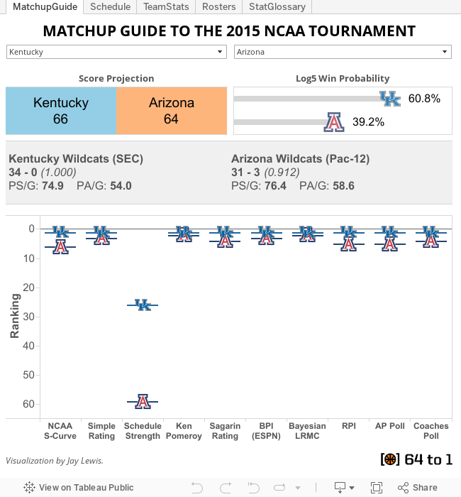
Like most high-profile sports, basketball is enjoying a statistical Renaissance both at the pro and college level, and there are a number of ranking systems to help us project outcomes. RPI, which relies on win/loss and strength of schedule, has been part of the selection committee’s seeding methodology since 1981. RPI is an older method, though, that doesn’t account for margin of victory, so alternate models were developed in more recent years by Jeff Sagarin at USA Today, Dr. Joel Sokol at Georgia Tech, Dean Oliver at ESPN, and Ken Pomeroy, a former meteorologist turned basketball statistician whose ranking system and advanced metrics have become a gold standard in recent years among analysts and coaches, many of whom use his website to supplement their own scouting reports and video analysis.
Data visualization at its core is a channel of communication, so before I build a visualization I try to think through some basic questions about the objectives. Answers to those questions can help inform our design decisions.
Who is my audience, and what might they want to learn about the topic?
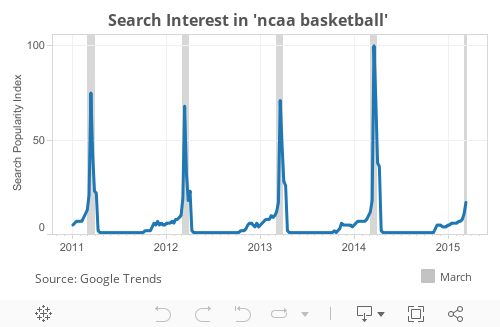
We know that most of the interest in college basketball is driven by the tournament. The season officially tips off in November, but a large number of people will only pay attention for about 7 days in mid-March. That spike in the Google Trends graph shown below isn’t associated with the Final Four, but rather with the week running from Selection Sunday to the end of the first weekend of games when the tournament field narrows from 68 to 16 teams. At that point most brackets are busted, and interest falls off sharply. We can also assume that a large percentage of the millions of Americans who fill out brackets each year go into the exercise with minimal knowledge about the teams. The more dedicated fans likely know more, but there are always potential dark horses from smaller conferences that get little to no media coverage.
Is there a specific message to communicate, or should the viz be more of an open-ended research tool?
Dashboards can lean more explanatory or exploratory, so this question gets to the heart of how much interactivity to incorporate. Oftentimes the best visual representation of an idea will be simple and static, and there’s nothing wrong with that. It’s like the bassist/bandleader Charlie Mingus once said:
Making the simple complicated is commonplace. Making the complicated simple…that’s creativity.
In this case, we want to provide information to help people make picks, but we don’t necessarily want to encourage everyone to make identical picks or advocate for specific teams. Given that framework, all signs point to an exploratory dashboard where the user can select and compare teams. Ideally it should have a high-level recommendation while also offering an opportunity to drill down into the finer details.
What data will I need and how do I get it?
Now comes the fun part. There’s a wealth of data about the teams, players, and regular season games at sports-reference.com, and most of that data lives on HTML tables, which are relatively easy to scrape with Python. If you prefer not to get your hands dirty with coding, import.io is a good alternative. For the KenPom.com data, I only used the top-level statistics that he provides for free on his overview page. It’s worth noting that a $20 yearly subscription fee gets you access to more advanced statistics behind a paywall. While I’m a subscriber myself and would recommend it to anyone interested in college basketball, I didn’t use the advanced data in my visualization. For one thing, I don’t need the advanced stats to calculate the head-to-head probabilities and score projections. More importantly, though, it respects boundaries while minimizing the risk of overstepping our rights to fair use of the data.
Once I had all the data I wanted, I built a small database that included a couple of extra details like a lookup table that accounts for subtle differences in naming conventions between the two data sources (e.g., VCU = Virginia Commonwealth). I also pulled stock icons (50x50 png files) for any team with a legit chance at making the tournament and saved those in a Shapes folder under My Tableau Repository. Then it was all in place to build a matchup evaluation tool.
Good luck with your bracket, and remember that you’re not so much picking against the bracket as against other humans. If you can anticipate potential herd mentalities due to biases, that’s the sort of thing that can give you an advantage.
Autres sujets pertinents

Meet Iron Viz 2024 Finalist Jessica Moon
 15 avril, 2024

Meet Iron Viz 2024 Finalist Pata Gogová
8 avril, 2024

Student to BI Analyst, How Tableau Can Lead to a Successful Data Career
 20 mars, 2024
Abonnez-vous à notre blog
Recevez toute l'actualité de Tableau.