In Chaos, Clarity: Social Network Diagrams in Tableau


It’s Hacker Month which means that throughout August we celebrate the creative uses of Tableau Public to do something unexpected or out of the ordinary. This blog post today is dedicated to the Tableau Zen Masters who have arguably produced some of the “hackiest” vizzes out there: e.g. here , here, or here. Which makes sense, because by definition they are Masters of Tableau who “show a deep understanding of how Tableau works”, and their creations are “works of art, perfectly balancing functionality and beauty”. (See here, to learn more about the Zen Masters Program.)
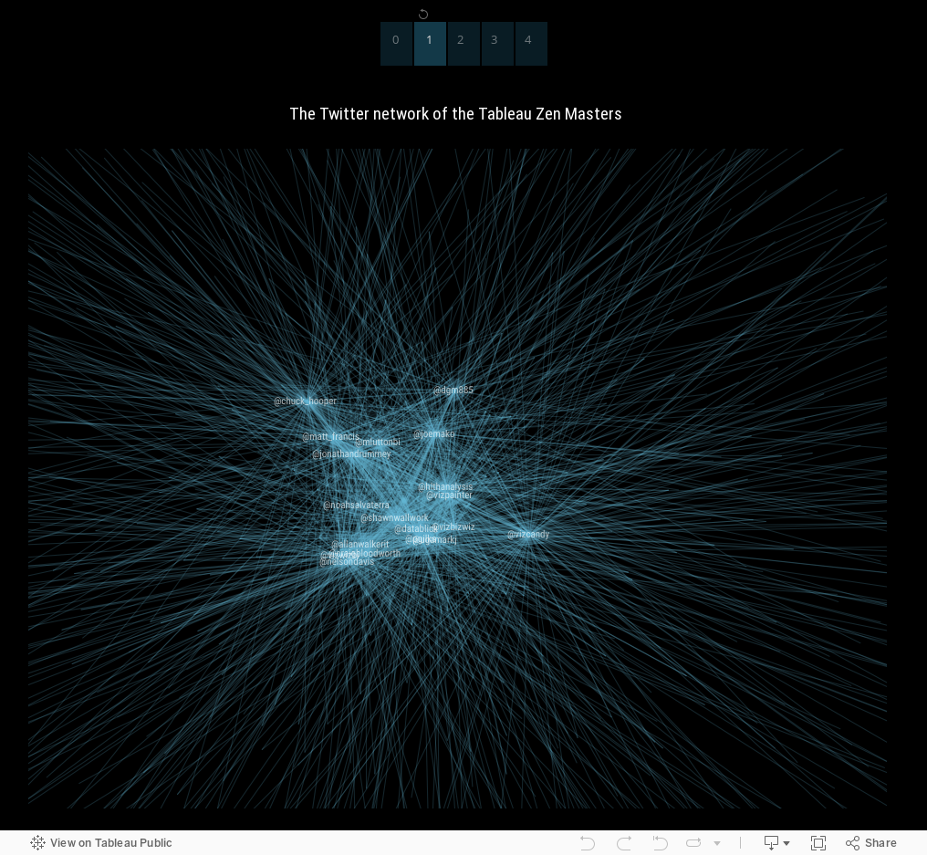
However, instead of featuring one of their vizzes, I decided to build a viz that features the current batch of Zen Masters. More specifically, I decided to visualize their recent activity on Twitter. You see, besides being masters of their craft, another requirement to become a Zen Master is for them to be actively engaging with others in the community and to be influential on social networks. Let’s take a look at how we can visualize that.
One popular chart type for showing social media activity are network diagrams, and we frequently get the question, whether these can be done in Tableau. While network diagrams don’t feature in the Show-Me menu, they certainly can be put together, with a bit of out-of-the-box thinking. As with many other more “hacky” vizzes, they leverage the fact that Tableau can render anything in a 2-dimensional space which has x and y coordinates. The following is a step-by-step instruction how to do this.
Getting the data and their x/y coordinates through NodeXL
How do we get those x/y coordinates? For this we will need to use a dedicated network charting tool (such as Gephi) or the right package for R or Python. In my case I decided to use an add-on that is available for Excel: NodeXL. It is free and simple enough to use - like Tableau, it requires no coding. It can also interface directly with the Twitter API, saving steps in the process of downloading and preparing the data.
To query the Twitter API, go to the NodeXL tab in Excel, and choose “Import”. You can search for certain topics or hashtags, or you can use a list of twitter handles as a starting point for your query. I did the latter: I used this Twitter list which has all the current Zen Masters on it. NodeXL then got me their 500 most recent tweets, who the messages were directed at (@mentions and replies), as well as any hashtags included in the tweets. Depending on your settings this step can take a while, so you might want to enjoy a cup of green tea while you wait for the data to download.
When the twitter data is in our Excel spreadsheet we can draw a network diagram that has the twitter handles as vertices (the dots in the network) and the individual tweets as edges (the lines) between the sender and a recipient (@mention or reply). NodeXL lets you choose from various layout algorithms that determine the placement of the individual dots. I chose the Fruchterman-Reingold algorithm, which is a popular choice for social network diagrams. It tends to bundle more connected dots in the center, and it places less connected dots further out on the periphery of the chart.
While NodeXL lets you draw the network fairly quickly there isn’t much more that you can do with it. So the next step will be to import the data into Tableau where we can analyse it, format it and interlink the network with other chart types, before publishing the final viz on Tableau Public.
Getting the data into Tableau
Once you have chosen your algorithm and let it do its work (by clicking “refresh graph”), you have to instruct NodeXL to save the x and y coordinates for the individual vertices: in the NodeXL tab click on “workbook columns” and ensure that “layout” is selected.
NodeXL saves the data in two separate spreadsheets: one for the edges and one for the vertices (In other tools these are sometimes called nodes). I copied these over into a fresh Excel workbook. I then unpivoted the edges such that the two columns vertex 1 and vertex 2 are now stacked on top of each other, because in Tableau we need one column, not two. See my colleague's excellent intro to path diagrams, for why and how to do this.
Before the unpivot, I created a new column that gives the name of the connection (“Vertex 1 – Vertex 2”). This will later serve as an identifier for the different relationships between Twitter handles. NodeXL has already included an ID column that uniquely identifies each individual interaction between two Twitter users. The two are not the same, because between some people several messages were exchanged.
Note, because in our network we are connecting people who send out a tweet with those who are on the receiving end (@mentions or reply-to’s), we are dealing with a so-called directed network, which means that the two sides of each edge are not equal. For that reason it might make also sense to include a column that indicates this – I have simply labeled the two sides A and B. If we were showing Facebook friendships for instance, the edges would be undirected, and we wouldn’t need to worry about it.

Reshaping the edges spreadsheet
The final step in the data-preparation process can be done in Tableau. Once we have connected Tableau to the Excel file, we can join the vertices and edges spreadsheets. Specifically we want to use a left join on “vertex”, with the different edges on the left-hand side, and the data from the vertices spreadsheet – most crucially the x and y coordinates – on the right hand side. Now we are good to go and can play on the Tableau canvas.

Joining the edges and the vertices spreadsheets
In Tableau a network diagram is essentially a path diagram, where we tell Tableau the horizontal and vertical positions of the individual dots, how to break up the long line that connects all the dots into shorter lines between 2 individual dots, and in what order the dots are connected.
In our case we start by pulling the X and Y fields on the columns and rows shelves, and switching their measure types to averages. We then switch the mark type to line, and, initially at least, add ID to the mark’s shelve to get a line connecting the different dots. Finally, by adding the “Vertex A/B” variable that we had created earlier onto the “path” field, we tell Tableau to draw a separate line from each A vertex to its respective B vertex. Voila there is our network diagram!
Before we proceed we should apply a little bit of formatting here. We want to hide the axes and the grid lines, choose some contrasting colors for the lines and the background, and – most crucially – we want to set the transparency for the lines really high: This adds that appearance of “depth” to the graph that is so characteristic for network diagrams.
Using semi-transparent lines also means that connections with several tweets appear more prominently than those that just have one tweet, because the different lines are lying on top of each other.
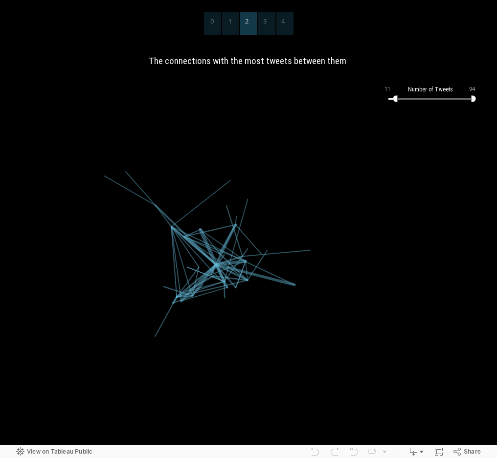
Another way to draw the network
This brings us to an alternative way we could have put together the network diagram. We could set the level detail of the chart to the level of the relationship between two accounts, instead of individual tweets. To achieve that we replace the ID pill on the marks shelve with the Vertex 1 - Vertex 2 variable that we had created earlier. Now there is at most just one line going from one dot to the other (although there could be another one running in the opposite direction), even if the recipient was mentioned in several tweets by the same twitter handle.
To show how strongly connected two people are, we can now draw the width of the line according to the number of tweets that were exchanged. Alternatively we could adjust the color gradient accordingly. To do that we move the ID variable, using the right mouse button, onto the size or the color fields, and chose COUNT in the menu. Play around with size and color settings, until you find a combination that works for your data.
The advantage of this variant is that you can do more analytics with it. For instance, you can add a slider filter to filter the relationships according to the number of interactions that they have with each other (see below). The disadvantage is that for multi-tweet relationships, you now can’t see the individual tweets anymore in the tooltip.
Adding the dots
While this network chart looks impressive, and it is fun to explore the network with the filter or simply by hovering over the lines, it is not the easiest chart to read. But so far we have only visualized the lines of the network. Let’s add marks for the individual dots of the network as well.
To do that we add a second instance of AVG(X) on the rows shelve, and we chose “Dual Axis” in the menu. For this second scatter plot, we change the marks type to “Circle” and we replace our variable on the marks shelve with the Vertex dimension, in order to get one dot for each vertex of the network.
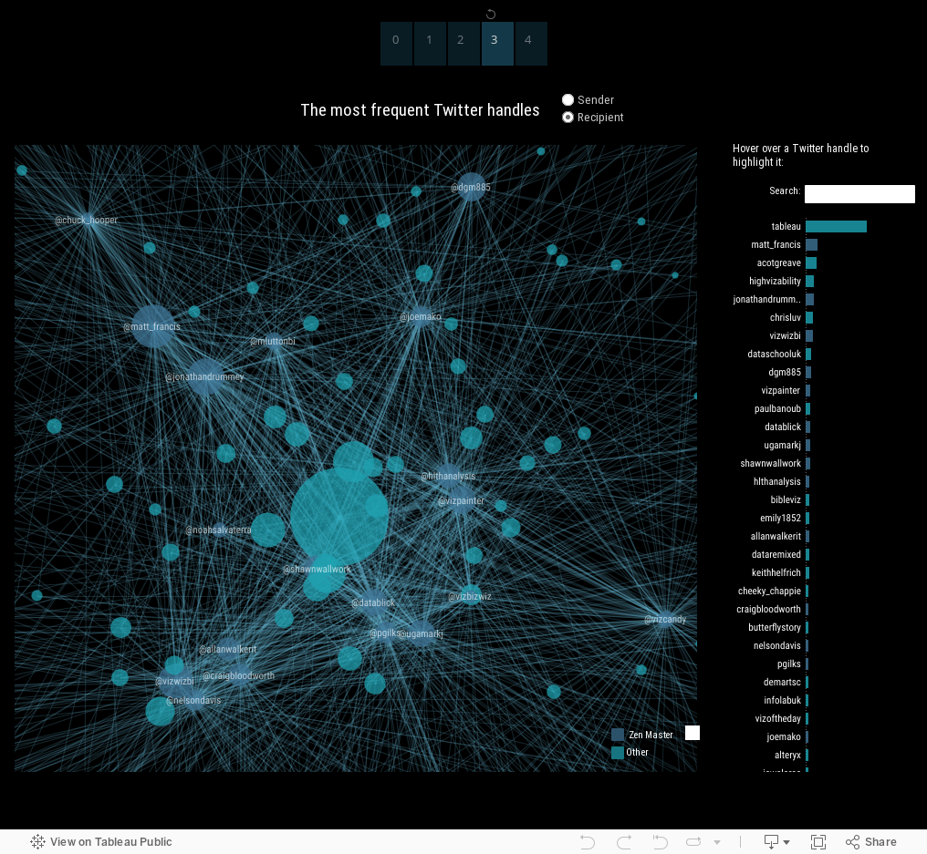
Adding other charts
To make things clearer for the eye, we can have the size of the dots vary according to some measure of how connected they are. Here I chose to look at how many times these people were mentioned in tweets. Not surprisingly Tableau got the most @mentions.
You may have noticed that I have sneaked in a bar chart as well, so as to facilitate understanding of what is going on. While this highlights a general drawback of network diagrams – it can be hard to wrap your head around the jumbled mess of lines - it also shows where Tableau’s strengths come in: you can add filters, tool tips, as well as other charts that can be linked to the network via dashboard actions, like I have done above. Bit by bit we can learn more about the data.
Digging even deeper
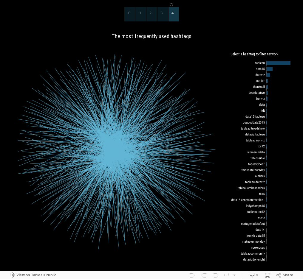
We have looked at who has tweeted, who was mentioned, and who tends to have a closer relationship with whom on Twitter. Lastly, we can also look a bit deeper into what they actually talk about in their tweets. For that let’s add the hashtags to the chart.
Once more we list the hashtags on the right hand side. Now, however, we link the two charts with a filter action, so that when you click on a hashtag it will filter out the corresponding lines of the network. That way we can see where the conversation takes place in the network.
The sky's the limit
There’s be a lot more we could do. We could look at replies and retweets. We could add the date and see how conversations unfold over time. We could also add geographic location, number of followers, or profile information – perhaps utilizing line charts, maps and URL actions, in addition to the network chart. I will let you try these yourself. If you do, be sure to tweet us the result using the hashtag #VizHacking.
Histórias relacionadas

Meet Iron Viz 2024 Finalist Jessica Moon
 15 Abril, 2024

Meet Iron Viz 2024 Finalist Pata Gogová
8 Abril, 2024

Student to BI Analyst, How Tableau Can Lead to a Successful Data Career
 20 Março, 2024
Subscribe to our blog
Receba em sua caixa de entrada as atualizações mais recentes do Tableau.