The Data Work Behind LA NACIÓN’s Hambre de Futuro Project


This blog post was co-written by 2017 Tableau Public Ambassador and La Nación data analyst Gabriela Bouret and La Nación graphic designer Mariana Trigo Viera, with additional insight from project lead Micaela Urdinez from Fundación La Nación. For more on La Nación’s data driven projects, check out their Tableau Public profile and their blog.
According to the National Institute of Statistics and Census of Argentina (Instituto Nacional de Estadística y Censos or INDEC), 41.4% of Argentinian children and adolescents currently live in poverty. Alarmed by this measure, La Nación launched its Hambre de Futuro ("Hungry for the Future") project. This project explores childhood poverty in Argentina, highlighting stories from the most vulnerable locations in the country. We aimed to put the structural problem of childhood poverty on local agendas and to give a voice to the children affected by poverty.
After learning about these children, La Nación audience raised approximately $500,000 for improving facilities and setting up scholarships. And while there’s many contributors to a successful journalistic project, one resource La Nación leverages is data visualization. As we’ve previously shared on the Tableau Public blog, data visualizations are a great tool for educating your audience about the stories that matter most to you and your organization.
Data analysis and visualization also affect the work behind these stories—how your stories actually unfold, informing your decisions as you progress towards a final product. For instance, by analyzing the results of this study by the Observatory of Social Debt of the UCA (Catholic University of Argentina), we knew which cities we needed to travel to in order to get a real look at the most vulnerable locations in Argentina.
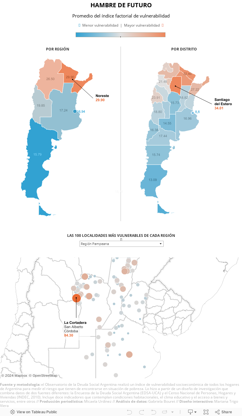
In that light, we want to share our process behind creating one of the project’s more influential data visualizations, “Promedio del Índice Factorial de Vulnerabilidad.” You can download the data set and follow along, seeing what new insights you can find.
Start with a Question
There’s can be no great data stories without great questions. We asked: where are the most vulnerable areas in Argentina? Answers to this question would inform both where our journalists traveled and how to help our audience would see and understand where poverty is located.
Select Great Data
The biggest challenge for this data project was also our best asset. Our data set came from the above-mentioned study from the Observatory of Social Debt of the UCA. Our data was representative of an incredible 3,542 locations throughout the country, each with its own number of households and dimensions. We knew that the sheer volume of data would inevitably lead us to insights, but we needed to transform it and find the most important story for our reader.
Choose What to Tell
The first decision we made was to select the data we were going to work with. From the original dataset, we chose to focus our analysis on only the 100 most vulnerable cities in each geographical region of Argentina. We determined which cities were most vulnerable by consulting their average factorial vulnerability index. We also narrowed our analysis to include three main variables: Population, Housing, and Quality of Life.
Decide on the Chart Type or “Protagonist”
What type of chart will help you tell the best data story? Because our data is bound to cities, we decided our protagonist needed to be a map. We used an automatic tool to geolocate the 539 cities selected for our work, and then performed a manual check to verify that the geographical coordinates were correct.
Find and Emphasize the Key Insight
We found that our main indicator — the vulnerability index score — varied if we looked at the map by geographical region, province, or locality. We therefore found it necessary to show three maps at the same time in order to facilitate a comprehensive look at the problem.
Because we wanted to help our audience explore the data, we assembled an interactive visualization that could be customized and rapidly reused. But we also wanted to ensure that our audience didn’t lose the context while they explored, so we kept the region and district views static.
Add Other Mediums to Help Tell the "Full" Story
Each data point in the Hambre de Futuro is reflective of a person’s experience of poverty. We therefore felt it was important to match the data with real-world stories, so as to not forget the people behind the visualization.
Equipped with insights from our data visualization, the journalistic team was able to prioritize their travel plans according to the most vulnerable places. We produced interactive reports that included text, photos, and videos that focused on children. This format allowed for poor children from all over the country to share their experiences.
Find Partners to Elevate Your Project
UNICEF provided assistance, enabling us to help with grassroots public policy proposals. Through Toyota’s "Start Your Impossible" initiative, we received vans to reach some of Argentina’s most inaccessible places. We also had the support of our strategic partner Banco Hipotecario and other other companies who provided the necessary funds to cover the costs.
The world needs world-changing data stories. We hope we’ve provided some steps to take for your own projects, and encourage you to share your projects through Tableau Public! Need a project to get you started? See what insights you can draw from our data set. Or, volunteer your data skills to Viz for Social Good, a social data project that empowers mission-driven organizations to visualize their stories.
Histórias relacionadas

Meet Iron Viz 2024 Finalist Jessica Moon
 15 Abril, 2024

Meet Iron Viz 2024 Finalist Pata Gogová
8 Abril, 2024

Student to BI Analyst, How Tableau Can Lead to a Successful Data Career
 20 Março, 2024
Subscribe to our blog
Receba em sua caixa de entrada as atualizações mais recentes do Tableau.