Visualizing Dense Data: How to Show Rank without Overcrowding Your Viz


Note: This is the second installment of a two-part series on visualizing dense data by Yvan Fornes.
In my previous post, I explained how to use an area chart to display dense data by cutting and superposing bands. Now I'd like to share with you a second way to visualise dense data. This tip is based on a Viz of the Day by Matt Chambers:
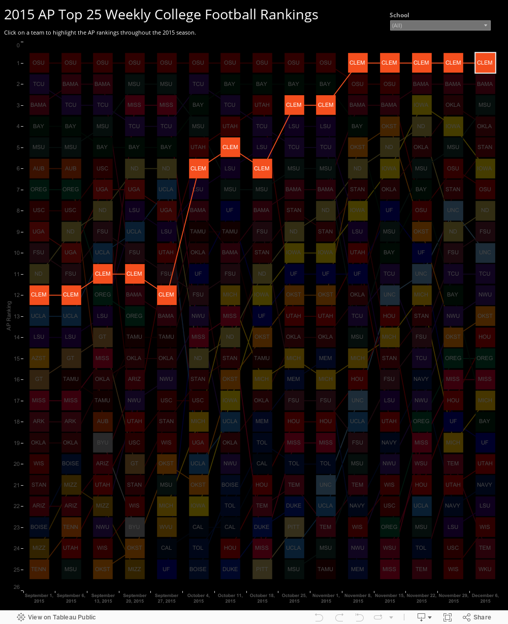
Matt used shapes to visualize the rankings in a simple and intuitive way. I didn’t know when I’d use this technique, but I knew that at some point I would. That time came a few months later.
I was asking myself how I could improve myself as a father. I have two wonderful kids: Thibault, who is 9, and Robin, who just turned 7. And I thought that data and Tableau could help me answer this question.
I found a study published by UNICEF titled “Children’s Subjective Well-Being in Rich Countries,” and I visualized the data in Tableau.
To explore my viz below, select a country using the dropdown control on the left. The bottom view shows how the country ranks for various criteria. If the flag sits to the left, the country is among the best for the criteria considered.

I discovered that French fathers like myself have a lot to learn from the Dutch. Indeed, when looking at the percentage of children who find it easy to talk to their father, the French fathers are ranked 28th out of 29 countries ☹ while the Dutch dads rank first. So I guess I should plan my next vacations in the Netherlands.
Lesson: Ranking Can Make for a Dense Viz
In my viz, I did not have enough space to display all the flag shapes like Matt did. I tried, but the dashboard was too narrow (with the width set at 950 pixels for the iPad). It looked too busy, as you can see below, even if I highlight just the selected country.
So I needed to find a way to display only one flag. The problem is that to calculate a rank with a table calculation, we need all the marks to be in the viz. So we need to find a way to hide all the flags but the one of the selected country.

How to Create This Viz
Here are the five steps to creating the viz.
1. Create a calculated field to distinguish the selected country.
To hide all the flags but one, we need to put the flags to be hidden in a specific category. To do so, we are going to create a calculated field based on a parameter.
- First create a parameter to let the user select the country.
- Then create a calculated field.

The calculated field looks at the dimension [country]:
- If the country name is the same as the one selected in the parameter, then the country name is kept.
- Otherwise, we change the country name to "others."
We’ve now segmented each row of the database source into two categories that we can treat differently.
2. Rank your dimension with the first measure.
- Add the first measure you want to use to rank your dimension on the column shelf. In my example, the measure I’m going to use to rank the selected country is “easy to talk to fathers."
- On the Marks card, add the dimension to rank (in my example, “country”) and also the calculated field you just created. We need both dimensions to compute our rank.
- Add the rank table calculation to your measure by right-clicking on your measure pill, then clicking on “quick table calculation” and “rank.” Right-click again on the measure, then on “edit table calculation" > “running along” > "advanced." Place both dimensions in the addressing section. It should look like this:

3. Assign custom shapes.
Now we are going to add the flag for the selected country and hide the "others."
Use a custom shape to assign a flag to the country. If you don’t know how to use custom shape, you can use this help page.
The trick is to assign a transparent pixel to “others.” Thanks to our calculated field, we have only two members (in the below example, “United States” and “others”). So we can assign it to “others” the same shape, a transparent pixel. You can get a transparent pixel on this site.
Your screen should look like this:

It seems that American fathers are listening to their children better than the French (26th instead of 28th for the French), but there’s still room for improvement. So if you are an American father, you should plan a trip to the Netherlands like me, or to Iceland, which is a beautiful country, a bit closer, and ranked second for this criteria.
4. Add all the measures for which you would like to see the rank as well.
To display other measure ranks on the same x-axis (columns), you can blend axes. For each measure that you add to the x-axis, you need to repeat the second step to calculate the rank.
This is what you should get:

5. Assign a custom shape for all the dimension members.
In our example, we assigned a flag only to the United Sates. Now we need to do it for all the countries that can be picked in the parameters. This is a bit tedious. You need to select with the parameter (that you created during the first step) every possible member (in my case, the countries) and assign the appropriate shape (in my case, a flag) like we did during the third step.
I hope this trick will be helpful for some of you, and the viz interesting and useful in improving all of our children’s well-being. If you have any questions, do not hesitate to leave a comment or to contact me on Twitter @YvanFornes.
Have fun with Tableau!
Related Stories

Iron Viz: Student Edition 2025 Top 3 Visualizations
 March 14, 2025

5 Ways to Use Tableau Public to Achieve Your Goals
 January 11, 2025

Shaping 2024 with Data: A Year of Data Visualizations on Tableau Public
 December 28, 2024
Subscribe to our blog
Get the latest Tableau updates in your inbox.