Highlights from Makeover Monday: Election-Data Edition


This post is featured as part of Election Month.
For Makeover Monday, a weekly social data project, we recently tackled poll-tracking data for the upcoming US election. The data source was kindly provided by Drew Linzner of Votamatic. The data is also feeding the dailykos.com trackers.
This turned out to be one of my favourite weeks as it proved just how many different ways you can tell a story from a single data set. Let me share a few of my favorites.
Ryan Rowland made a highly creative radial-stacked bar chart. Not only is this imaginative and engaging, it’s inspired Ryan to start a new blog with a detailed explanation of how he built the viz.
Spent a bit longer than an hour but learnt some cool stuff.. #MakeoverMonday #ElectionViz #week42 https://t.co/iVZq5rFRRQ Trump vs Clinton pic.twitter.com/GDvJfd84xB
— Ryan Rowland (@rkrowland87) October 17, 2016
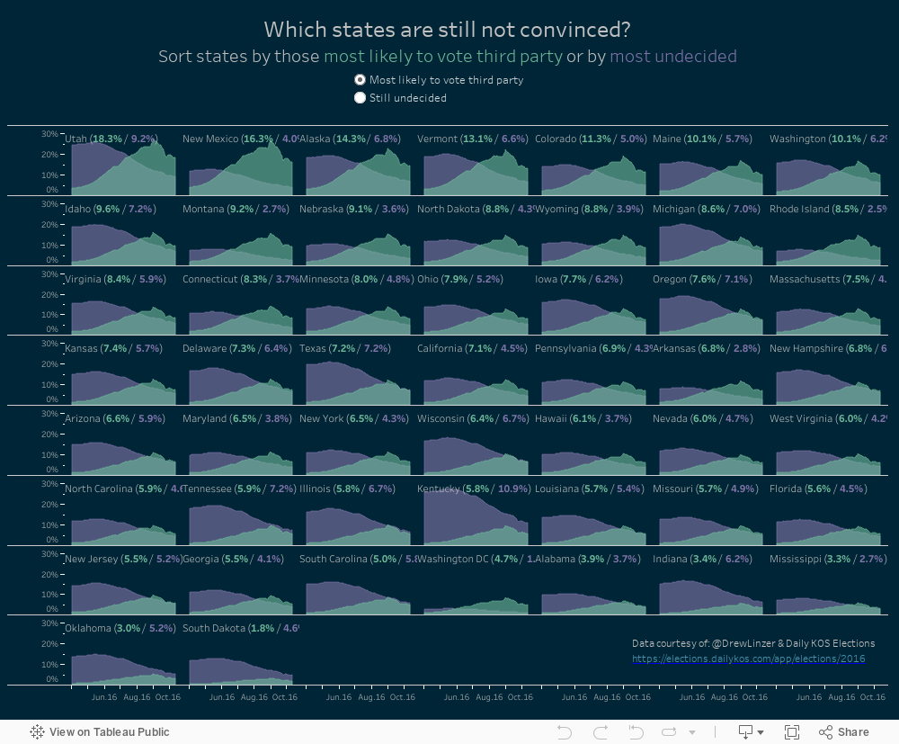
Curtis Harris showed that you don’t have to focus on the obvious data to tell a great story. While others focussed on the battle between Donald Trump and Hillary Clinton, he looked at the independent and undecided categories to find another intriguing story about which states remain to be convinced by the leader.
Michael Mixon created a work which looks beautiful and has easy-to-grasp depth.
Lots of fantastic vizzes this week. So much inspiration#MakeoverMonday @VizWizBI @acotgreave @DrewLinzer ,@dailykoshttps://t.co/5QxkMeerz6 pic.twitter.com/S0EUhhss2v
— Michael Mixon (@mix_pix) October 20, 2016
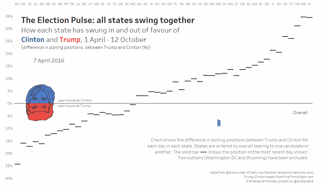
Finally, I turned to animation to show the “pulse” of each state, as they rise and fall in a very similar way throughout the campaign.
We’ve seen over 61 makeovers submitted this week with this data. This, once again, makes me grateful to our amazing community, and shows how it’s possible to find unlimited insights in a data set.
If you haven’t yet got involved in Makeover Monday, I highly recommed you do. We’ve had almost 2,500 submissions from more than 400 people. Can we reach 500 people by the end of the year? That’s up to you!
Head over to our training page for all of our election-themed tutorials. And tweet us your viz @tableaupublic using the hashtag #ElectionViz!
Related Stories

Meet Iron Viz 2024 Finalist Jessica Moon
 April 15, 2024

Meet Iron Viz 2024 Finalist Pata Gogová
April 8, 2024

Student to BI Analyst, How Tableau Can Lead to a Successful Data Career
 March 20, 2024
Subscribe to our blog
Get the latest Tableau updates in your inbox.