5 Tips for Making Your Tableau Public Viz Go Viral


To this day, I am grateful when even a single person checks out one of my data visualizations. I often think back fondly about my very first Tableau Public visualization, a simple view showing NFL interconference records over time. The viz is not my best work—if anything, it’s my worst work—but I was so excited to discover that I can share interactive data stories for free through Tableau Public (so awesome!).

The viz now has over 10,000 views.
What I like most about this viz is that it’s a constant reminder of how much you can improve if you stick with something, and it’s also a testament that any viz has a chance to be a popular success.
Among a few other vizzes with at least 10,000 views, I now have three others with at least 35,000 views, one that recently cracked the six-figure milestone, and even one with over a quarter-million views (seen below)! My work has been featured by The Guardian, U.S. News & World Report, and Grantland—all with zero marketing budget and no established journalism platform on which to share my work.
This post shares the five tactics that made it possible.
Disclaimer: While I certainly do not believe that a visualization's value should be judged exclusively by how many views it has, I do believe that part of a data visualization's success should be judged on whether or not it made an impact. And sometimes you need a larger audience to see a viz in order for it to make an impact. I have seen incredible work on Tableau Public with fewer than 100 views. In fact, that’s why I wanted to write this post—to help as many Tableau Public authors as possible have their deserving work discovered by a larger audience.
1. Create ‘Remarkable’ Content
For your viz to have any chance of going viral, it is critical that it is remarkable in some way. When I say remarkable, I am talking about Seth Godin’s literal definition of remarkable, meaning your work is interesting enough in some way that it makes people remark about it. In today’s social media age, remarking about your work often means sharing it on social media with new audiences—one of the biggest contributors to viral success.
Tableau Public visualizations can be remarkable in different ways. Perhaps you have found a compelling story to share or a unique approach to sharing that story in Tableau. Or maybe you have done a phenomenal job using the next tip to your advantage: Balance data and design.
2. Balance Data and Design
It seems there are two camps in data visualization: the data purists who feel aesthetics are unnecessary or even counterproductive, and those that believe design is a worthy component to data visualization. I am firmly in the second camp. My stance stems from how I define the purpose of data visualization: to find and share actionable stories that are based in quantitative evidence.
To make your insights actionable, this means sharing them with the most relevant, and many times, largest audience possible. If you don’t provide your data stories in a well-packaged design, you drastically minimize the chances of your work spreading, and thus, it is consumed and acted on by fewer people.
The good news is that anybody can improve the design of their Tableau Public visualizations. Last year, I shared “Five Ways to Balance Data and Design in Tableau without Graphic Design” right here at the Tableau Public blog.
3. Leverage Search Engine Optimization (SEO)
I mentioned in the introduction that even my first and most basic Tableau Public visualization has hit the 10,000 views milestone. Here’s a Google search result for the term “NFL Interconference Records”:

Among the 31,000 results, there’s a link to my (possibly worst) Tableau Public viz in the second position, right behind the NFL itself and ahead of popular websites reddit and Wikipedia. I attribute this search result directly to search engine optimization, or SEO.
SEO can feel like a mysterious marketing strategy, and in some ways, it is. After all, nobody knows Google’s search algorithm and we have no control over it. However, there are some basic SEO tactics that will dramatically improve the chances of your viz going viral by being discovered by the right person in search.
These tips are assuming that you have the ability to embed your visualizations on a platform that you control. If you don’t have your own blog, I encourage you to work through the "A-Z Miniguide on Setting Up a Data Blog."
- Most importantly, try to get in the heads of your audience and think about the terms they might use to talk about your viz. People go to Google to ask questions, and if you can integrate the words people are using to ask those questions into your work, there will be a better chance that Google will believe your viz is the best answer to their question.
- Create a descriptive page title using the terms people are searching for. It is tempting to try to be cute with your page titles, but descriptive titles do better in search. For example, I could have named my Odds of Going Pro in Sports viz and post “You won’t believe how hard it is to do this in sports.” Like a bad clickbait ad with a strange picture on it, this title may do a good job of getting clicks when it’s shared on social media, but it’s not what people are searching for in Google. So after the initial social push, it would be difficult for this to be found again. Instead, people are searching for “What are the odds of going pro in sports?” and this viz continues to be found regularly today, two years after it was originally published.
- Provide some thoughts around your viz in your post. There is very little metadata for Google to find in a Tableau Public visualization itself. Write at least 250-500 words about your viz to describe what it’s showing and what key insights it provides. This will give Google more information about what your viz is about so that it knows if your viz can help answer a searcher’s question.
4. Network
Everyone knows that if you want a visualization to be publicly consumed, one of the first places to share it is on social media networks such as Facebook, Twitter, LinkedIn, Pinterest, etc. To take this a step further, I take note whenever I have a breakthrough. That’s when a popular account shares my work or a journalist picks it up for his or her own content. I will then reach out to them directly the next time I have new material that is relevant to them. This tactic takes time to cultivate, but the snowball effect can be extremely impactful.
There is a fine line between building relationships and spamming, so beware. I am not suggesting you send an email to everybody in your audience who has ever looked at your work, but I may pick two to three people to share each new viz with directly, and only occasionally when I genuinely think the work is relevant to them. This tactic has led directly to second shares on U.S. News & World Report as well as the popular social sharing site Digg.com. Be sure to pay back these members of your network by supporting their work as well. And also be sensitive to not spamming them if you are getting hints that your work may not be as relevant for them anymore as you may think it is.
5. Use Reddit
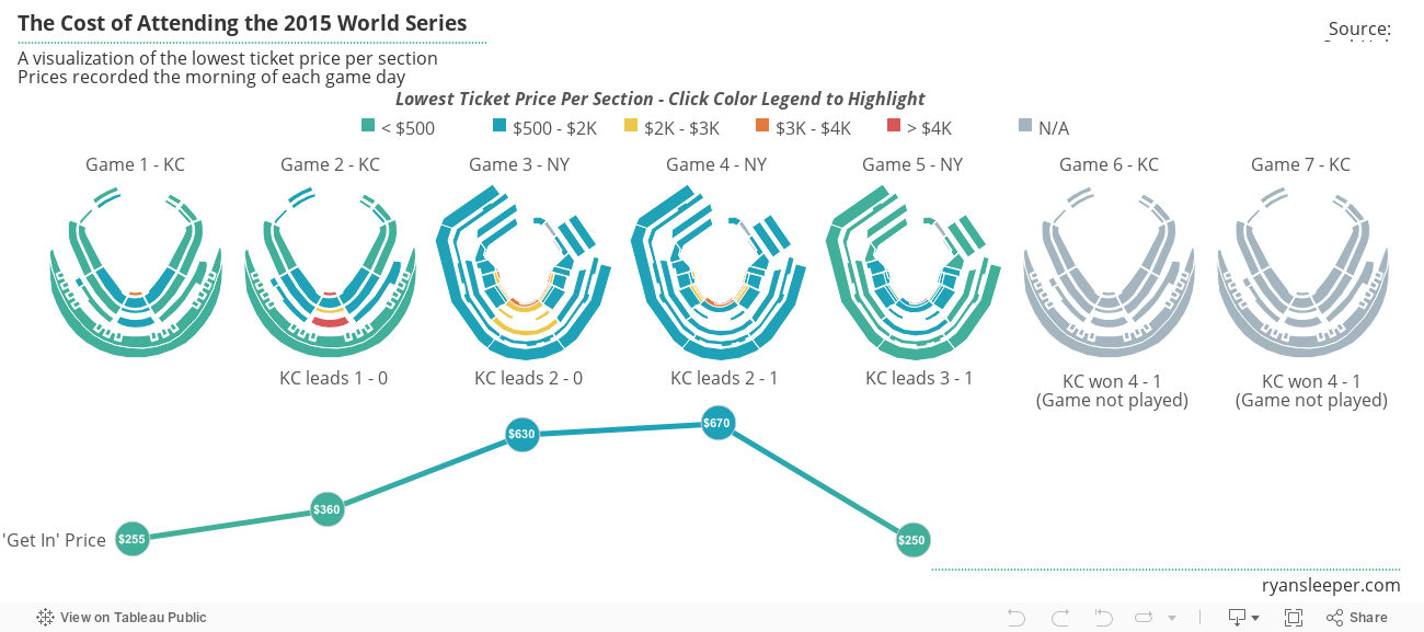
The reddit.com/r/dataisbeautiful subreddit has an enormous and relevant audience for Tableau Public authors. Using reddit provided the majority of views on my most popular viz to date, The Cost of Attending the World Series, and provided a spring board for the most viral viz I’ve ever seen, Tableau Zen Master Adam McCann’s Analysis of the Beatles. With such a huge potential audience, it is exciting to jump right in and think you’ll instantly gain fame and fortune. However, it took me several years to have a breakthrough on reddit, and here’s what I learned along the way.
- You have to genuinely immerse yourself in the community there. You cannot get away with only posting your own content. Support others by upvoting and commenting on their work or by sharing content from others.
- When you share your own content, make sure a thumbnail preview image is picked up with your post. The easiest way to guarantee this is to embed your Tableau Public visualizations on your own site, with a prominent feature image somewhere in the post. Studies have shown that email campaigns with images earn a 42 percent higher clickthrough rate, and the same principle applies to the dataisbeautiful subreddit.
- Reddit says that original content (OC), or content submitted directly by the content’s creator, performs better on their platform compared to non-OC content. This may be true after you have been using reddit for a long time and built a strong reputation in the community, but this has not been my personal experience. My work has always performed better when somebody else submitted it. I don’t have the science to back this up, but I think people are less likely to view and share work if they think there is even a chance that the person posting the content is self-promoting or sharing the content for the wrong reasons. I encourage you to experiment with both OC and non-OC content. If you don’t have a colleague handy to submit your content, I’d be happy to take a look and share relevant visualizations myself (just let me know @OSMGuy on Twitter).
Ultimately, we don’t have full control over how popular a Tableau Public visualization will be, but don’t let that discourage you. Not every single one of my Tableau Public visualizations have been a hit, but there is always something positive that comes out of every one. I’ve either discovered a new approach to visualizing certain types of data or created a new example that I can use in training. At a minimum, I get a chance to practice and learn something new for next time.
I also know that if the five tips mentioned above are taken to heart, the viz can be discovered and go viral at any time. If you adopt these tactics as part of your process and stick with it, I’m confident you will see a noticeable lift in your Tableau Public visualization views.
March 2016 is #TableauTipsMonth on the Tableau Public blog. Share your favorite Tableau tip in the comments below, or tweet it to us @tableaupublic.
相关故事

Meet Iron Viz 2024 Finalist Jessica Moon
 2024/04/15

Meet Iron Viz 2024 Finalist Pata Gogová
2024/04/08

Student to BI Analyst, How Tableau Can Lead to a Successful Data Career
 2024/03/20
Subscribe to our blog
在您的收件箱中获取最新的 Tableau 更新。