The Best Part of Back-to-School Season? College Football


Note: This piece is part of Back-to-School Month here on Tableau Public.
Nothing signals the end of summer and the start of the school year like football season. College football is how we dampen the sadness of the end of summer break and the return to campus—well, at least for some of us.
College football, like most sports, is rife with data that can be used to create compelling data visualizations. I love how members of the Tableau Public community and students alike have creatively taken their visualization skills to college football data.
College football data is more team-oriented than the NFL, where players can move around from team to team and are often bigger stars than even the teams themselves. In college, it's all about the team, the program, and often the head coach.
Dynasties often emerge in college football, like the current Alabama Crimson Tide under coach Nick Saban. Before them, there were the Florida Gators with Tim Tebow and Urban Meyer ascending to the pinnacle of the sport twice in a three-year span. And of course, who can forget USC in the early 2000s under Pete Carroll, featuring such stars as Carson Palmer, Reggie Bush, and Matt Leinhart?
These three dynasties I remember, so it was easy for me to recall them; for older dynasties, however, we need to harness the power of Tableau to jog our memories.
Lucky for us, Matt Chambers, Zen Master and sports-data guru, has done just that in this wonderful visualization showing the entire history of college football. Select different conferences from the drop-down menu and see how schools have performed over time, with gold bars representing National Championship seasons.
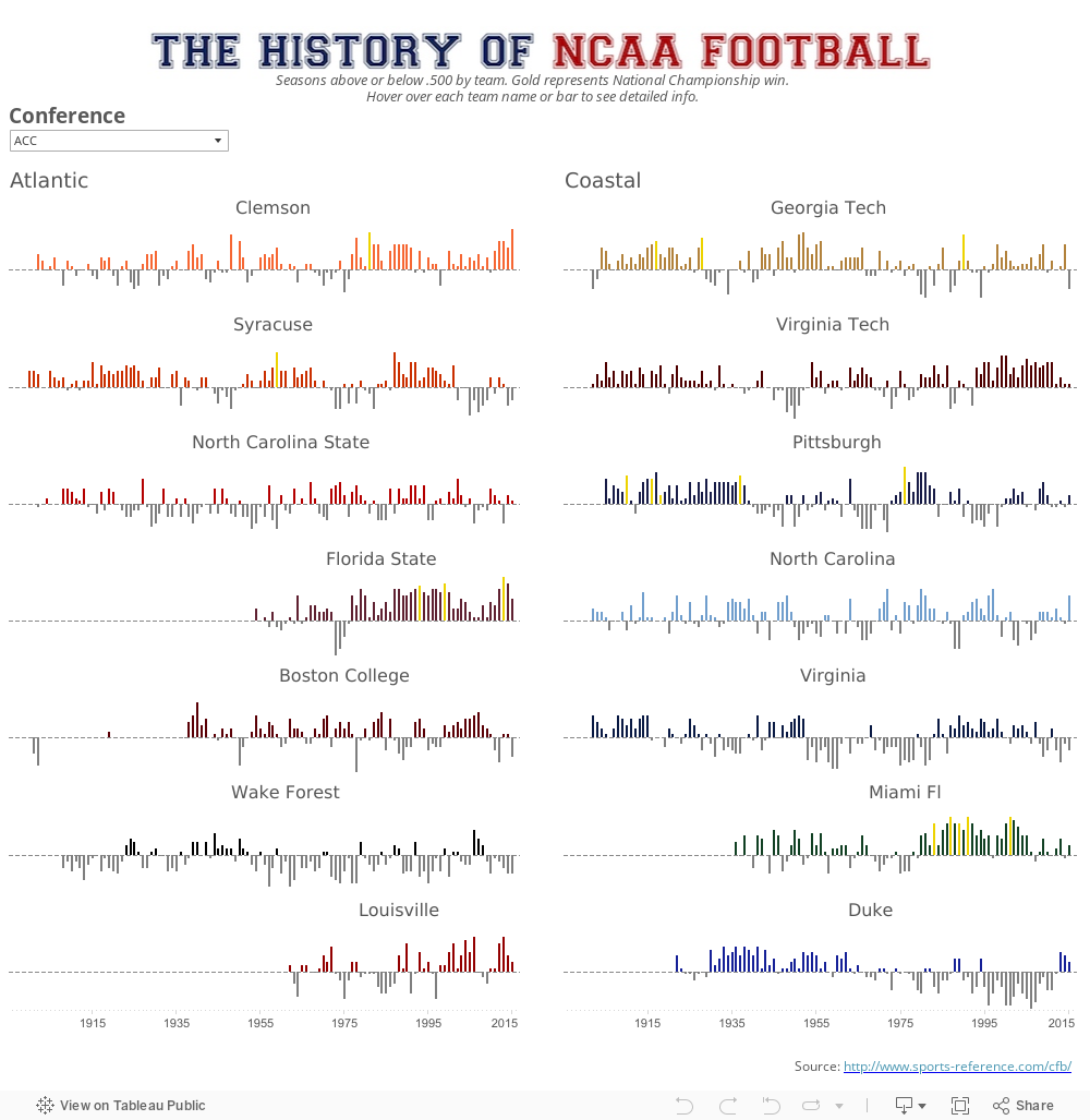
There are so many insights you can make from this wonderful visualization. For example, I had no idea that my school, Stanford, won the National Championship in 1926—just a few years before I showed up for my Freshman year.
For a more nuanced view of how an individual school has been performing, check out the work of Matt's fellow Zen Master, Rody Zakovich's. Rody's analysis shows Florida State's team and its recent propensity for overcoming large deficits. Rody expertly uses small multiples to illustrate the "comeback kids" nature of the Florida State team. And the best part is you can go out and grab this same data for any team in the country and recreate Rody's viz.

Or for a look at a different part of the college football universe, we have this viz from Andy Kriebel, another Zen Master. This viz looks at the world's 25 largest stadiums. Look at how many of them are college football stadiums!

Each of these three vizzes visualize a different aspect of college football. This diversity of storylines is what makes college football one of the most compelling sports to follow. Here's to hoping it makes going back to school that much more fun for all of us!
相关故事

Meet Iron Viz 2024 Finalist Jessica Moon
 2024/04/15

Meet Iron Viz 2024 Finalist Pata Gogová
2024/04/08

Student to BI Analyst, How Tableau Can Lead to a Successful Data Career
 2024/03/20
Subscribe to our blog
在您的收件箱中获取最新的 Tableau 更新。