Using Tableau in the fight for social justice


Peter Kim is the Communications and Digital Engagement Coordinator at Pivot Legal Society, a human rights organization based out of Vancouver, British Columbia. He's sharing his insights of how Pivot Legal uses Tableau to engage supporters and the public to enact change.
Pivot Legal Society's mandate is to use the law to catalyze systemic change for marginalized communities. Through strategic litigation and advocacy, our lawyers fight their battles on behalf of the homeless, drug users, sex workers, and victims of police violence in the courtrooms of law and aim to create systemic change for these communities throughout Canada.
But we also fight in the courtroom of public opinion, which is where I use Tableau to engage our supporters and the public to pressure politicians to reform unjust, discriminatory laws. A big part of what we do in fighting for reform is public advocacy, and this is where Tableau has proven to be an invaluable tool.

Canadian Association of People Who Use Drugs’ national day of action, Feb. 2017
Highlighting the severity of British Columbia's drug overdose epidemic
The Downtown Eastside, where our office is located, is the epicenter of North America’s overdose epidemic. It’s estimated that four people are dying each day, and last year alone 978 were killed by illicit drug overdose. The calamitous scale of human suffering has led the BC Coroners Service to gather and release vast quantities of extremely current data in order to rapidly respond to the growing crisis. This data has allowed me to underscore the urgency to the public by showing how significant the increase has been, while also putting the numbers in context relative to other cities in Canada.
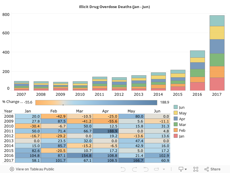
This latest data, current as of August 15, is a mid-year snap shop projecting a much worse year in 2017 relative to 2016 in terms of overdose deaths. Currently BC is on track to exceed 1,400 fatal victims of overdose, which would shatter 2016’s total of 978. I designed the visualization to reveal the breakdown by month and auto-filter from one graph to the next using the “hover” dashboard action. It was important for me to not only convey the aggregate number of fatal overdoses, but also connect it to the percentage increases, revealing how this problem is swelling out of control month by month.
Visualizing this data communicates and resonates in a way words alone cannot. It assigns meaning to sterile numbers that can galvanize support that demands change from politicians. A local journalist who saw our Tableau graph embedded it directly into his article, further extending the reach of our messaging. Having Tableau readily provide embed codes through its dashboard facilitated this.
More opportunities to engage
Having the ability to visualize data allows us to take even the simplest datasets and turn them into useful content—data that otherwise would be difficult to articulate effectively. In that sense, Tableau broadens our range of communications and gives us more opportunities to engage the public on important topics.
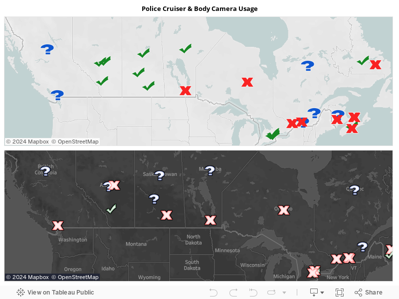
Above is an example of very basic data that is much more interesting when seen as a map. It was manually collected and compiled by one of our staff lawyers and a summer law student. Afterwards, we bandied around ideas on how to best articulate the findings, given that many police forces refused to comment. It was decided that a map would be the most visually appealing; and here, Tableau’s versatility, which extends beyond just graphs and scatterplots, helped us reveal the disorganized patchwork of body/cruiser camera adoption rates by major police forces across Canada.
Strengthening the social experience on mobile
One of the things I love about Tableau, and why I use it so religiously, is its mobile friendly output. Much of our web traffic comes to us through smartphones; and every month that percentage grows, so it’s important for me to use software that recognizes this. Tableau’s graphs fit and interact nicely on the limited real estate of smartphone screens, which translates into more interest and deeper engagement. This also enables us to enhance social content, which most people consume on their smartphones.
10 reasons you need to vote on May 9 (cc: @dtes_collab @YVRTenantsUnion @PovReductionBC @stopdisplacemnt @CCAPdtes @BChomeless) #bcelxn17 pic.twitter.com/5G2RpvlxQz
— Pivot Legal Society (@pivotlegal) May 1, 2017
Pairing graphs with apps like Ripl and Legend, or even turning them into a gif strengthens engagement because it snares the attention of a digital audience scrolling quickly on their handheld devices. Making our content more memorable in this way helps us persuade people to care about the causes we fight for—or at least take a moment to pause and consider what we’re saying—and inspires them to act in service of a more just and equitable society.

Pivot lawyer DJ Larkin presenting at United Nations’ Committee on Economic, Social and Cultural Rights in Geneva, Switzerland
As one of British Columbia’s leading human rights organizations, Pivot Legal Society is fighting for change on many fronts, and in today’s digital age it’s becoming increasingly important for us, and other progressive groups, to engage the pubic where they are; namely, online. To that end, Tableau has helped us widen our influence and strengthen our support as we fight for systemic social change in British Columbia. It’s one more tool in our digital tool kit—and a very valuable one.
相关故事

Meet Iron Viz 2024 Finalist Jessica Moon
 2024/04/15

Meet Iron Viz 2024 Finalist Pata Gogová
2024/04/08

Student to BI Analyst, How Tableau Can Lead to a Successful Data Career
 2024/03/20
Subscribe to our blog
在您的收件箱中获取最新的 Tableau 更新。