#MyRecentViz: How to Prioritize and Optimize Your Shopping?


Editor’s note: This is a guest blog post by Lauren Stevens. As we are about to enter the post-Christmas sales period, we invited Lauren to discuss the visualization she recently created around Black Friday shopping. This post is part of the #MyRecentViz series of blog posts and webinars, each deconstructing a beautiful and insightful viz. See here for previous installments of this series.
The Questions
Each year, millions of consumers participate in Black Friday shopping - it’s the one day a year that virtually every retailer offers special discounts and sales.
Over the years, select stores have been opening as early as Thanksgiving Day, while others have refused to open until the day after. The disparities among retailers pose a challenge for consumers: deciphering and juggling the various opening and closing times to determine how to prioritize accordingly. With limited time, savvy shoppers also have to evaluate hundreds of door buster promotions, consider which stores are offering the best deals, and determine which local shopping district(s) will allow them to visit the optimum amount of stores based on their personal agenda.
As a savvy shopper myself, I was motivated to build a viz that would overcome these barriers by helping Central Florida consumers prioritize and optimize their Black Friday shopping experience.
The Viz
The first dashboard is essentially a virtual shopping catalogue to help shoppers identify items they want. The list of stores allows users easy interactivity between websites in a single view.
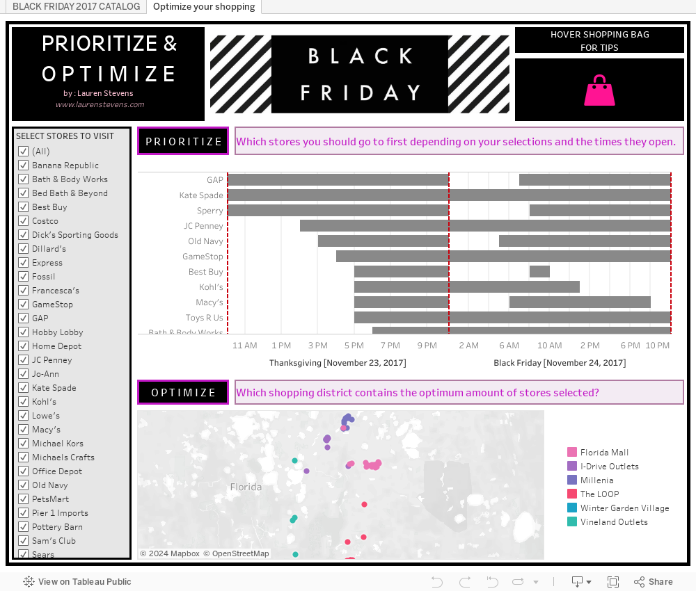
The next dashboard is where the magic happens. At first glance, users are asked to select the stores they plan on visiting in the left-hand filter, which generates data on both vizzes.
The objective of the first viz is to “prioritize” the stores you want to visit (in the order of soonest opening times) via a Gantt chart. The objective of the second viz is to “optimize” your shopping trip by choosing the shopping district that offers the optimum number of stores based on your custom store selections via a map.
Since retail is a huge passion of mine, I wanted to include tips based on my personal experiences. This is why I built a shopping bag tooltip at the top right to allow users to hover for some ideas.
The Answers
The “Black Friday 2017 Catalog” offers an easy way for users to flip through store ads and evaluate deals - after all, the vizzes in the second dashboard are meant to be customized to the user.
Once users have identified stores of interest, they are instructed to select them in the filter on the next dashboard. This generates data to answer the two objectives of this dashboard. First, it addresses the order in which the user should visit each store. Second, it tells the user which shopping district offers the optimal amount of shopping, according to their selections.
Since there are a few stores that open at the same exact time, I built a tooltip within the bars to remind users of the advertised storewide savings and leave it up to them to determine which receives precedence.
The Data
Wrangling data for this project was by far the most time-consuming component. I built my data set from scratch and wrangled all the store opening and closing times one by one (which is why this is only for Central Florida!) In the days leading up to Black Friday, I was challenged by the fact that not all retailers promote their sales and store hours in advance. During times when searching the internet was inconclusive, I was forced to make phone calls to retailers to capture the data from the sources themselves.
For the map view, I had to wrangle the X and Y coordinates for each of the retail locations associated with the various districts in order to properly plot them. In addition, I had to research each and every store to identify in which of the six shopping districts they were located in.
All data was captured in Excel and connected to a Tableau Packaged Workbook.
The Design
I am a huge fan of building dashboards with a purpose. For this reason, I wanted to help users focus on two main questions by clearly labeling them above each viz:
- Which stores should you visit first depending on your selections and the time they open?
- Which shopping district contains the optimum amount of stores selected?
As much as I wanted to throw in some other fun stats such as “ratio of retailers opening on Thanksgiving day versus Black Friday” or “percentage of savings by category of store”, I didn’t want to lose sight of the purpose of this dashboard - to prioritize and optimize the Black Friday shopping experience.
Closing Thoughts
I acknowledge that this dashboard was primarily beneficial to residents in Orlando, FL. Ideally, I would have wanted to incorporate data from all retailers, across every shopping district, spanning the entire United States, along with respective opening and closing times. This would allow me to roll up data to the city and state level, offering value to consumers in other regions. Due to the substantial amount of data wrangling I endured for Orlando, FL alone, it would not have been feasible. However, considering the fact that I have the current framework established, I plan on updating this dashboard each year and expanding shopping districts in the greater Orlando, FL area over time.
One tip I would like to pass along to the Tableau Community is to start with a rough sketch on paper and build according to that. I have found that building dashboards is as much an art as it is a science. Being intentional about which charts you include and where you place them have a LARGE impact on how you tell your story, and whether your viewers will be able to easily digest it. I also believe that communicating data successfully means being able to share it with anyone in the world without having to provide much context to them at all.
相关故事

Meet Iron Viz 2024 Finalist Jessica Moon
 2024/04/15

Meet Iron Viz 2024 Finalist Pata Gogová
2024/04/08

Student to BI Analyst, How Tableau Can Lead to a Successful Data Career
 2024/03/20
Subscribe to our blog
在您的收件箱中获取最新的 Tableau 更新。