Using Tableau's Clustering Feature with Map Layers to Get the Full Picture


My best friend spent last year as a classroom assistant at one of the most underfunded and underperforming schools in Washington, DC, Anacostia Senior High School. According to US News, all of the school’s students are economically disadvantaged. All are people of color, and only 38% of them will graduate from Anacostia.
These facts led me to ask broader questions about the school district. Are other student populations in the same school district facing the same issues? Are the struggling schools concentrated in areas with high concentrations of people of color?
I wanted to see the percentages of at-risk students within each school. I also wanted to see whether those figures are related to the surrounding area’s demographics. So I decided to explore the data at the district level.
Creating Categories with Clustering
I used Tableau's clustering feature to create groups of high, medium, and low concentrations of at-risk students. By leveraging k-means clustering, (which groups data points based on how close they are to each other), I could easily create these categories based on the at-risk percentages across the entire data set.
The clustering feature is located within the Analytics pane on the left side of the worksheet. I brought the field that I wanted to cluster (AVG(Percent at-risk)) and specified the number of clusters—in this case, three.
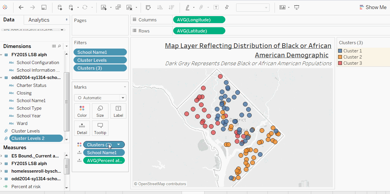
Tableau automatically assigned the three levels “Cluster 1”, “Cluster 2”, and “Cluster 3.” I copied the cluster pill and dragged it to Dimensions, and Tableau automatically turned the clusters into three groups.
I right-clicked on the newly-grouped field and changed the names. I also reassigned the colors by right-clicking the group and changing the colors within the canvas.
Adding Map Layers to My Clustering Analysis
Next, I wanted to add the demographics of each school’s respective area to my analysis. So I decided to import map layers of census information.
To add the layers, I clicked on the Map menu tab and selected “map layers.” Then within the map layers pane, I selected the demographic information that I wanted shown in the background of the map. This data comes from US Census data as well as data from Nielsen.
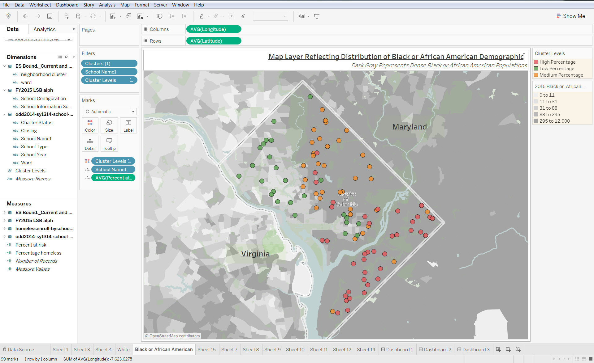
Now, with my clusters shown on top of my map layers, I can see the full picture.
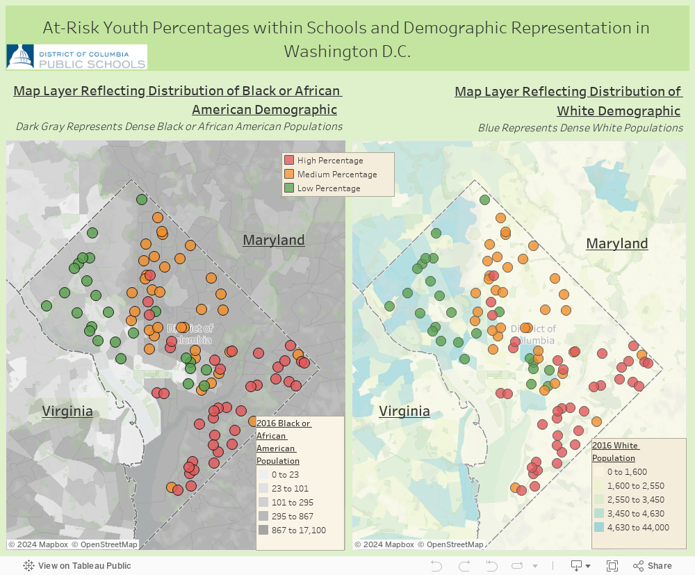
The blue background represents places where the white populations are most dense. The dark grey background layer represents places where populations of people of color are most dense. With the layers in place, I can now see that the schools with high- and medium-level at-risk populations tend be concentrated in areas that are non-white, and generally have a higher densities of people of color.
By using Tableau’s clustering feature with map layers, I not only unveiled the groupings in my data but also uncovered how the clusters relate to the area’s demographic data. In my case, I explored school district data, I can imagine many more use cases for this combination of features. Here are just a few:
- To understand geographically how demographic information might inform why certain diseases spread in certain areas within the US
- To examine geographically how demographic information can explain voter turnout percentages across the US
- To see how food quality can be understood from a geographical perspective
What types of analysis are you doing with the new clustering feature? Let us know in the comments below!
相關文章

Meet Iron Viz 2024 Finalist Jessica Moon
 2024/04/15

Meet Iron Viz 2024 Finalist Pata Gogová
2024/04/08

Student to BI Analyst, How Tableau Can Lead to a Successful Data Career
 2024/03/20
Subscribe to our blog
在收件匣中收到最新的 Tableau 消息。